Today’s guest blog is by Chris Wheeler, who has just graduated from DMID, his honours project focussed on portfolio creation and here he shares what he has learnt. Chris gained a first class honours degree and has secured himself a graduate position in UX research within a month of collecting his degree.
This is part two of Chris’s article on how to get the most from your portfolio- you can read part 1 here – http://blogs.napier.ac.uk/dmid/2018/07/24/117/
Personal Branding
A personal brand can be thought of as your professional identity. It is an opportunity for you to show employers ‘Who You Are’ and ‘What You Do’. Think of how you identity with yourself socially and how you describe yourself to new people. Are you British, American, Irish? Are you a gamer, sports fan or Netflix addict? Your personal brand (or professional identity) is the same thing but you are describing yourself to potential employers or clients.
To identify your own personal brand, you have to think about your experiences and what you want for your career. How are you going to achieve it? How do you want to be seen?
The following four aspects of personal branding can help your portfolio be unique to you.
Portfolio Layout
There are so many potential website layouts available to you that it can be daunting to think which one is right for your brand. Below is a list of some good tips to think about when choosing a layout.
- Research current trends. Design trends change frequently so you don’t want to have a great looking site…that people 3 years ago would be impressed with!
- You want someone to look at your portfolio for the first time and not have to ‘learn’ how it works. It should be easy to use and consistent in it’s functionality and design.
- Showcase your design process. Within your projects, it is beneficial to detailing how you achieved it. Storyboards, research, sketches, prototypes. They all show your ability to plan and organise a project.
- Publish, Review, Add, Delete. When you have published your portfolio online, it’s not finished there. You never know who and when people will look at your portfolio so it requires constant updating. Your layout looking a little dated? Update. You have more recent and better-quality projects? Update.
Logo
Your logo doesn’t have to be a fancy graphic. It can just as easily be a simple logo using a typeface. As long as that font is consistently visible throughout your brand, you have accomplished your goal. It is important to make sure that whatever design you choose to do (simple or detailed) that you are happy to have that as the ‘perception’ people will have of you.
Colour Schemes
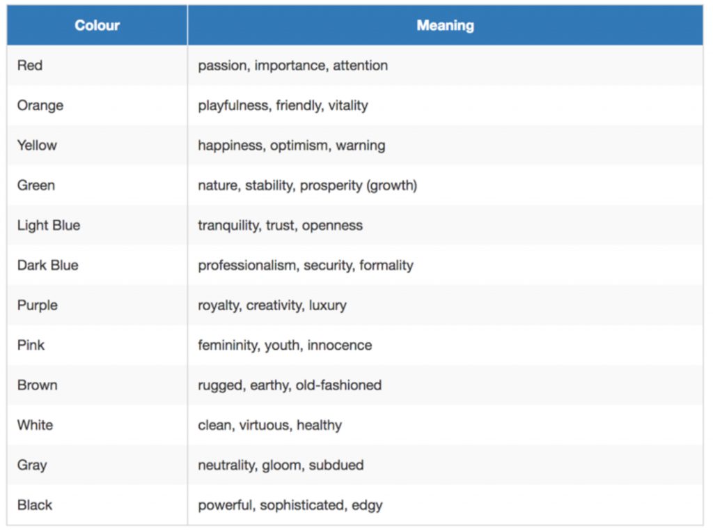
Colour can often have a phycological effect on human beings. Red, for example, is known as a colour that represents danger or a warning. Blue associates with tranquillity and white with cleanliness.
Because of this, the colour scheme you choose for your personal brand would benefit from a little research to see how you want it to be associated. Including a consistent colour scheme throughout your portfolio, literature and social media platforms provides a way to target your audience’s emotions and strengthens your brand awareness.
Your personal favourite colour may not necessarily hold the appropriate association you want for your brand, regardless of how pretty it might look. The below is an indication of some (not all) colours and their meanings.

Cross Platform Branding
Once your portfolio is complete, you want to share it. This can be to network, to gain clients or employment, or to just gain awareness that you exist in your industry.
You will likely have a form of social media to compliment your portfolio (and if you don’t….get one). It is an opportunity for your portfolio to be shared amongst your intended audience.
It is important that your social media pages have a consistent design and message to that of your portfolio. Your logo may have a colour-scheme; therefore, it is important your social media platform incorporates this where possible. Your portfolio may be branded with a certain ‘style’ of writing, therefore your social media pages should follow this same style.
Link as many of your accounts as possible to make this task easier. Can you post any media and blogs directly from Instagram, Twitter or Facebook to your portfolio? This keeps everything up to date in real-time.
Is the project name and description on your portfolio the same as when you talked about it on your social media pages?
Your portfolio should have a section which describes you, your career experience and ambition. Do your social media pages match this description?
These are just a couple of examples of what to consider when cross-platform branding. What’s important is that you think ‘consistency’ first, at all times. Is your brand visible and recognisable regardless which platform you are using?
We’ll be following up this article with some posts sharing some of our students and graduates portfolios over the coming months, so you can see how these tips work in practice. Thank you to Chris Wheeler and Emma Ramsay.