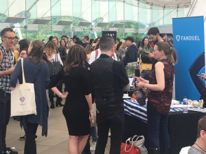
The UX Scotland conference was held at Dynamic Earth last week. I haven’t been to this event for a few years, as I chose to go to some of the other UX events like UX Live instead, however I was really impressed with the quality of the speakers at UX Scotland and I realise we are lucky to have this event here in Edinburgh and should take advantage of it.
It was great to see so many UX staff from other HE institutes there, and really useful to meet and chat with them about their challenges and successes. Having worked in the private sector for the past 5 years I’m always amazed at how open and collaborative the HE sector is!
I was energised and full of ideas after the conference – you learn so much from getting away from your desk, meeting others working in the same field, hearing about different approaches, new tools and techniques, things that have worked and not worked. Immersing yourself in another world for a while allows you to think differently, see the bigger picture, view problems from a different perspective, and – sometimes – suddenly see solutions appearing!
Service Design, Spotify Squads and Top Tasks
There were three presentations that I thought were particularly interesting or thought provoking:
The keynote from Kate Tarling, a UX Consultant specialising in the design and management of services in large organisations and working closely with with the Home Office. There was some useful practical stuff about focusing on services, identifying patterns in services groups and creating tools that would help users make better services, but the main thing I took away from this talk was that to really make any impact with UX projects, we need senior level buy in and possibly even structural change.
James Ferguson from Skyscanner delivered a great session on tackling design and engineering at scale. He spoke about how they adopted the Squad/Tribe methodology pioneered by Spotify. The Squad model is a small cross-functional, self-organised team with end-to-end responsibilities and – importantly – autonomy. This model is designed to allow people to build better products more quickly.
Although the model did allow Skyscanner to release more quickly, there were some serious consequences of having small autonomous teams:
-
Inconsistency between different parts of the product
-
Sitewide changes were almost impossible
-
and there was no central source of truth
These will sound familiar to anyone working in a large organisation.
What was interesting was how they tackled the problem – they reached out to the ‘giants’ – Amazon, Google, AirBnB to find out how they work, and now they are introducing a unified colour palette and working out the best way of communicating UI guidelines to the development teams in a way that works for them.
Obviously the best way of doing this will also depend on the structure of an organisation, but I would like to look at this in a bit more depth with our developers – and maybe involve some creative computing students to come up with some ideas for HTML coding styleguides.
Sophie Dennis from NHS Digital spoke about redesigning the Information Architecture for nhs.uk website (which makes redesigning our staff intranet look like a walk in the park!) Rather than structuring by condition (for example Diabetes), they are categorising by what she calls ‘Expressed Demand’ (for example ‘I’ve just been diagnosed with Type 2 Diabetes, what do I do now?’). This reflects what Kate Tarling spoke about in the morning about service provision, and made me think about the Top Tasks tool, and how we could use that for our Staff Intranet and Student Portal.
Guerilla UX Research
There was a session about using ‘Discount Usability Testing to gain UX insights’ that talked about the value of ad-hoc research when you don’t have a large budget. It wasn’t groundbreaking but it did confirm my thinking that UX research doesn’t always have to be costly and formal – especially in HE where we have students all around us who are usually happy to give feedback.
Stagnating UX (?)
The closing keynote was a session from Cennydd Bowles about how UX is stagnating. Slightly gloomy but certainly food for thought!
Conclusions
All in all, I would recommend UX Scotland to colleagues, both new to UX and more experienced UXers from all of the UX functions.
There is always work to do on getting senior buy-in to embed UX into the culture of the organisation, but there are also some learnings I can use straightaway, and it was great to meet up with the other HE Uxers and hopefully get some regular communication going.


Try and make it Design It; Build It which returns to Edinburgh in November. If you enjoyed UX Scotland, you’ll love our conference with speakers from across Europe and North America – http://www.dibiconference.com